

Ness
Building a wellness brand
Ness is a health and wellness focused rewards credit card where cardholders earn 5x points for purchases at healthy merchants and 2x points on purchases everywhere else.
The card comes with wellness related benefits, like access to a rewards marketplace, discounts on health coaching, and all the benefits that come with a Mastercard. The marketplace is full of wellness brands the company vets to ensure quality, brands like sweetgreen, Ora organics, On Running, and more.
The Goal
Ness is a unique wellness fintech and media brand committed to helping people become more healthy for the long term. The goal was to create an illustration style that would reflect the healthy life the Ness team hoped to help our customers create. We wanted the style to feel inspirational, motivating, and tangible.
Team
Company: Ness
Tools: Figma, Adobe Photoshop, pencil & paper
Scope
My Role: Visual Identity, digital illustration
Head of Experience: Kenneth So
Collaborating Designer: Bao Lam
Finding inspiration in fine art
With few credit cards in the wellness space, I along with the Head of Experience and our talented UI Designer, wanted an illustration style that would stand out. We did not want the style to feel like typical tech illustration and did not want the style to be dictated by what is scalable. We started by taking a deep dive into finding inspiration.
We wanted Ness to feel unique, so we turned to inspiration, outside of tech, in fashion and fine art, looking at painters like Shyama Golden and Ignasi Monreal. Their paintings have the ability to use objects and images to highlight complex themes.

Ignasi Monreal, Guccy SS 18

Ignasi Monreal, Guccy SS 18

Shyama Golden (left to right) Pattern, The Offering, Pattern
A health paradise
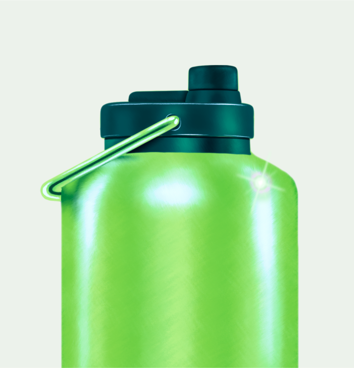
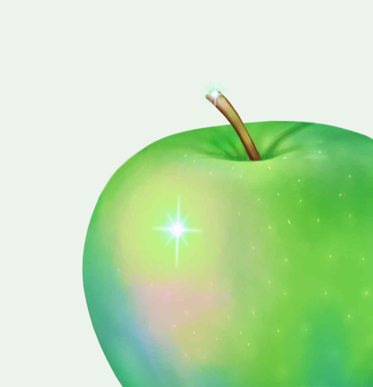
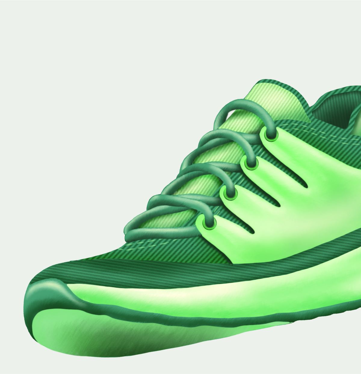
Both Golden and Monreal’s paintings fall into the realm of magical realism. This is something we wanted to bring into the Ness brand. The magical realism style enables us to build rich, healthy environments that are grounded in reality while showing magical elements as a part of everyday life.
With a fine art, painterly style, our illustrations convey inspiration, quality, and tactility. This relates to the quality of our products and the tangibility of the “health paradise” we want to guide our customers toward.


Putting it all together
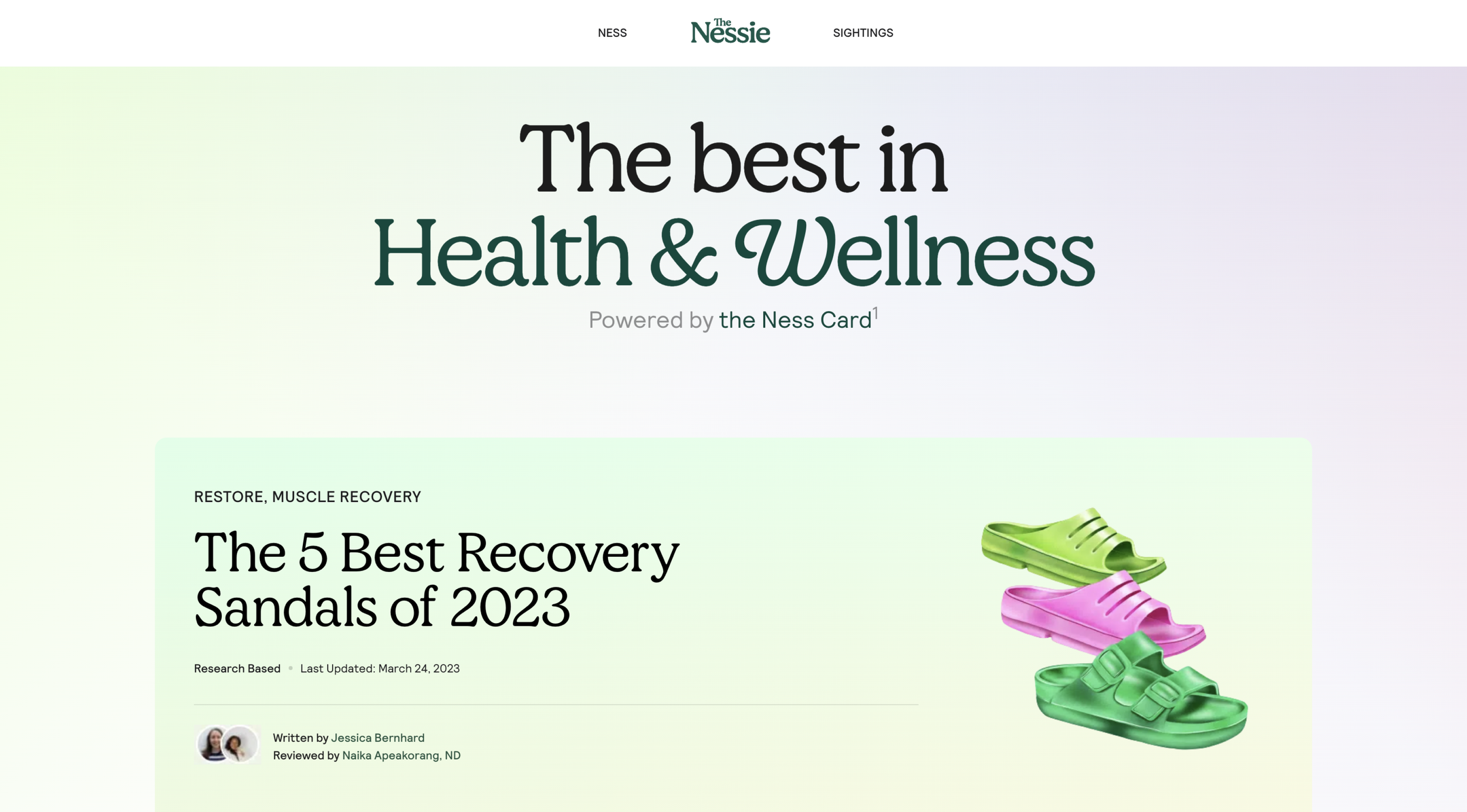
The team and I set out to incorporate the illustrations into all customer touch points, the website, the app, the Nessie (our newsletter), social media, and our swag.


Reflections
How illustration can shape the whole brand
The dimensional illustration style and color palate had a huge influence on the way the Ness brand evolved. When we began, we had a wider color palate, where we used yellows, tan, and even red. A lot of the colors used were flat and the illustration style was mostly flat color and line work.
Once developing the richer colors and surfaces of the illustrations, we began to notice what colors played well in the background. We started using a more sophisticated dark green for success screens and neutral smoky green for our lighter backgrounds. We started using gradients in the background to complement the iridescence colors of many of the illustrations. We started to notice the shades of greens that felt the most expressive and incorporated a brighter green into our components. In this way, the illustration style helped shape what the Ness brand is today.